One common thing I initially notice between a couple of the photos is how the photographer has tried to make the buildings appear grand. They all are very grand buildings but the photographers have pin pointed and exaggerated this. Looking firstly at Gropius’ “the flatiron Building” photo it is evident that Gropuis has angled the camera upwards so it is as if the viewer is looking up at the building when looking at the photo. The height of the building is intensified as Gropuis has taken the photo at an angle so as to be able to fit more of the length of the building in the photo. Gropuis didn’t have to include, as much of the building in the photo as he has but he is trying to make a point, saying this building is so big that even at an angle all of it cannot fit into the photo. Compare this to Evans’ photo of the same flatiron building. taken with the camera again angled upwards, with the same intentions of maximizing grandness of the building. Both pictures do indeed show the grandness of this building and even though both photographers have used the same technique to achieve this, they have chosen to focus on the grandness in a different way. Whilst Gropuis focused on the length and tallness of the building and in turn made the building look rather thin, Evans instead has decided to focus more on the width if the building than the length. In Evans photo the building does not look as lengthy but it does however look wider. You can see in Gropius’ photo that he has chosen to leave in the roofs of the other buildings to prove tot eh viewers even more that this amazing building is more than twice the height of other buildings. Evans on the other hand has chosen to leave in part of another building that may not actually be taller than the flatiron building but appears to be in the photo. Evans really isn’t focusing on the height; he is focusing on the width and generally grandness of this building.
Tuesday, 22 November 2011
Thursday, 3 November 2011
Rihanna- we found love
Watching the new Rihanna video a couple of weeks ago gave me ideas for my environment project. Strangely enough it did also help with my object project but im gonna focus on how it helped me with the environment project right now.

It's the way the film uses it's environment to help set a mood and build up a picture of what the song is trying to say through it's shots of the environment around them. Thats what i would like to do with my environment give a feeling and a mood to them, to help show my opinion of the place.
It's the way the film uses it's environment to help set a mood and build up a picture of what the song is trying to say through it's shots of the environment around them. Thats what i would like to do with my environment give a feeling and a mood to them, to help show my opinion of the place.
Wednesday, 2 November 2011
The person is the main focus of this picture but as this is a object project I can not have a person in the picture. Instead I could focus on the objects around them and how they have clumsily affected them. At first there will not be clear evidence why the room is trashed but as you look closer there will be hints of evidence such as bottles of drink, packets that have had drugs in them etc.
Im not trying to capture the few hours of fun you have while intoxicated, trying to capture the next day after the person has come to terms with what happened the night before.
Trying to depict the bad side of drugs and alcohol so should use dark colours, even some bits could be completely shadowed out like the head above. As we can't use people in the object project I could find a head of a mannequin and if it’s shadowed out you won’t be able to tell its not a real person, or maybe a leg on the floor sticking out of somewhere to make it look like the person has fallen over.
I like the way the camera has shaken so that the edge of the girl is blurred and jagged because that’s how things look sometimes to people under the influence. Im going to try and do this with my photos, I’ll have to ask for help from the tutors as I am not sure how to create this look with large format cameras.
I found this poster and thought maybe I could have a sign in the background on the ‘wall’ saying something like this. A kind of ironic statement to what im trying to say. The sign represents the attitude of the person, and the persons friends, that I have created that have caused problems due to alcohol. Where it’s funny, applauded and encouraged to be a complete messed and to drink the most. To go out get drunk, sleep with people and not care about your reputation, which is good but at the same time a little sad because you are constantly at a state where you are not thinking properly. It's almost a little sad that you have to get to that state. Also looking behind the psychology of people who depend on alcohol, sometimes get like that because you don’t want to be sad, look towards alcohol/drugs to stop the deeper sadness and loneliness.
Slim Letaief
I decided that as drugs and alcohol was going to be my idea that I would research artists that have used alcohol and drugs in their work. The first artist that i stumbled across was Slim Letaief. I found a picture from his series called 'Their Life'.

The alcohol in this photo looks appetising, it makes the viewer thirsty and want to drink it. Although there is a man in the photo, the focus is clearly the man because his heads chopped off and his food is burry and in the background. The focus is on the hand and the pouring of the drink, the viewer presumes what action is coming next which is drinking the drink. The lighting although black and white has a high contrast and is bright. Enforcing an enjoyable atmosphere. Also the man and surroundings look clean which help to reinforce this inviting atmosphere. It is almost like the man in the photo is inviting the viewer for a drink. This is the opposite of how i want to show alcohol, i want to show the bad side, not the glow feeling you get from sharing a few drinks with friends, the hungover, feeling sick feeling you get instead from drinking too much.
Concept
The object project we are doing has to be about a social issue and we have to get across your opinion on it. Therefore it should be something I care about or something that is effecting me or that i am involved in. Living at halls and being a student people go out and drink often. I therefore instantly thought maybe i could do my project on the social issue drinking, as drinking effects the community. People that are drunk and rowdy at night effect people living in the area with noise or knocking over communal objects such as bins, drinking effects the NHS as people go to hospital with drunk accidents or alcohol poisoning.
Tuesday, 1 November 2011
Perception
It is clear form the brief that my final photo should represent my opinion on a issue. We had a talk today about how two different people can look at the same photo but perceive it in a different way. "You don't take a photograph, you make it" Ansel Adams. This quote by Adams tells us that the photographer chooses everything that happens in the photo, the angles, the vibrancy of colours, the objects, lighting etc. A photo isn't just chance. So two photographers could therefore photograph the same object and portray two very different meanings from it depending on how they want it to be portrayed. Hence meaning that for my final prints I need to have a clear opinion on the issue I choose and how changing the lighting etc can help me to portray my view. If I am not clear on what my opinion is than i can't expect my viewers to know what im trying to get across.
Ansel Adams
Adam's photos have a very magnificent, romantic quality. They are still life's taken of these impressive environments.
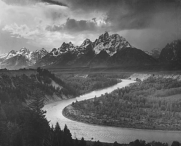
The light in this photo is generally soft and well exposed. It seems as thought the contrast in brought up while printing. I think that Adams thought highly of this environment. The sky, although being cloudy, is bright, linking with the bright tops of the mountains which draws the viewer in. The river is is in a 's shape' creating a line of beauty which forms a photo that is easy on the viewers eyes. There is a misty quality to the photo that creates mystery. Looking at this environment there are a lot of the trees and high terrain, it would be hard to know what was around. Adams shows this mysterious quality through the mist. Although this still life is shown in an honourable light, there is still darker parts to the picture. The darker, dangerous trees, leading up towards the darker bottom of the mountain. Adams is still letting the viewer know that this is still a dangerous place despite it's beauty. This beauty, mixed with mystery and danger gives the environment a higher respectful quality. This is a very grand photo.
OBJECT
Im now gonna work on my object project.
Brief: Develop a concept, plan, organise. Construct a still-life of your own using a still-life of your won, using colour film and a large format view camera.
Taking inspiration from the history of art and taking a visual approach, employed in traditional still life construct a photography based upon a current social issue. It is your chance to create your opinion on the matter through the still life.
Inspiration: Current issues or debates surrounding you. Newspapers, radio, internet, television etc.
Something you wish to make a comment on.
Something you feel strongly about.
Your photographic decisions will be crucial, how and why you shot the still life the way you did.
Sunday, 16 October 2011
Thomas Struth

In this photo Struth has drawn the viewer into the photo with the direct straight road leading the observer through the perspective. However the rubbish at the left and right side of the road cuts of the road into a thinner line drawing the viewer in further. This ‘thinner road’ isn’t directly in the middle of the photo, I think a direct line straight from the middle leading you in can sometimes be too harsh on a photo and make it uncomfortable to look at. However the fact the ‘thinner road is more to the right entices the viewers eyes effortlessly into the photo. He said that a photograph "has a clear language, one that speaks openly not only about its subjects ... but also very much about the attitude of the photographer toward these things. In this regard, a photograph is always objective.” Therefore in Struth’s opinion all photos tell you the photographers view on what they’ve photographed. Baring this in mind you can tell how Struth has decided to show how busy and crowded this environment feels. He has chosen to show all the buildings close and surrounding each other, there is no sky above the buildings in the foreground to show the height of the buildings and to create a crowded atmosphere.

Compare this to the second photo where there is sky in he foreground and it makes the environment feel a whole lot emptier. Also the position on the street that Struth has chosen to take the photo adds to this vacant feel, if he had chosen to take the photo further down the street where the buildings are taller and where he could have had no sky in the foreground than it would have created a busier, more crowded feel. Also the road width is wider than the two corners if the bottom width of the page which creates a feeling of space where there is not a lot going on. The fact that the road is clear of rubbish and clear of cars creates an empty feel also, compared to the road of the previous picture which is made to feel even thinner because of the rubbish either side.

This photo here from Struth's Paradise collection is completely different to the previous city/town environemts. This environment is in the middle of a forest, however although the picture may look completely different to the others and may have a different feel to it the same methods are used in it. There is a very busy, crowded feel to this photo and compare this to the first photo that is also quite crowded and busy and you start to see how Struth uses the tress the same way he uses the buildings. The trees, like the buildings, surround both sides of the picture and eventually further back into the middle of the picture. There is also a narrow stream slightly to the left of the picture leading the viewers eyes into the photo. Just like in the first photo where Struth uses the narrow road to lead the viewers eyes into the photo. One thing Struth uses int his photo that he does not use in the other photos is 'the line of beauty'. This is where a s shape is created in the photo to attract the viewers attention, it is supposed to signify energy, movement and is supposed to stir the viewers attention. The line of beauty starts at the beginning of the lake and follows it until the end of the lake and then curves up into the tress. The fact that the line if beauty is not int he other pictures means that he is trying to create a different feeling in the other two places.
Wednesday, 3 August 2011
Fantasy

I took these photos of my sister under the theme fantasy. The idea was of a girl being schizophrenic and her fantasy was these people she imagined.


Sunday, 31 July 2011
I love photography and these are some of the first photos i took when i started up photography. I didn't really have a main idea in mind but i had watched a Florence and The Machine music video, which is set in a wood. I loved the music video and the way the wood had homely things in it. his inspired me to taker my own wood photos. I took my sister out to the woods near my house and brought some of our homely possessions with us. I decorated trees with picture frames and these are a few of the pictures. The idea was a girl getting lost in the woods, hence the photo where she is sleeping on a log. But i also wanted them to have a kind of magical feel where she could actually be living in the woods.


Thursday, 19 May 2011
Art Exhibition + dresses
Tonight it's the UCA art exhibition where my photography will be displayed for people to see. I think i have to dress smartly for today, people were saying it would be nice to make the effort but im not sure how smart im supposed to be so i think im going to wear a dress that could be seen as smart or casual. Dresses are such saviours if your unsure of the casualness of the event. I love dresses <3
Subscribe to:
Posts (Atom)